
What It Really Takes to Build a Restaurant Brand Across Multiple Locations
Candela Creative Case Studies - FL Bakery Restaurants
A restaurant can open with a logo, a sign, a menu and a finished interior. That does not necessarily mean it has a brand. The distinction becomes increasingly important as a business grows.
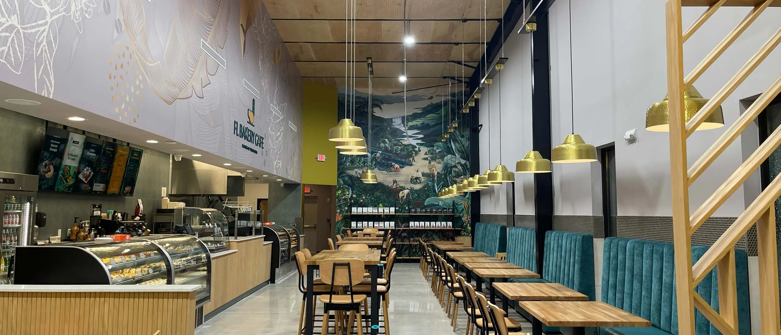
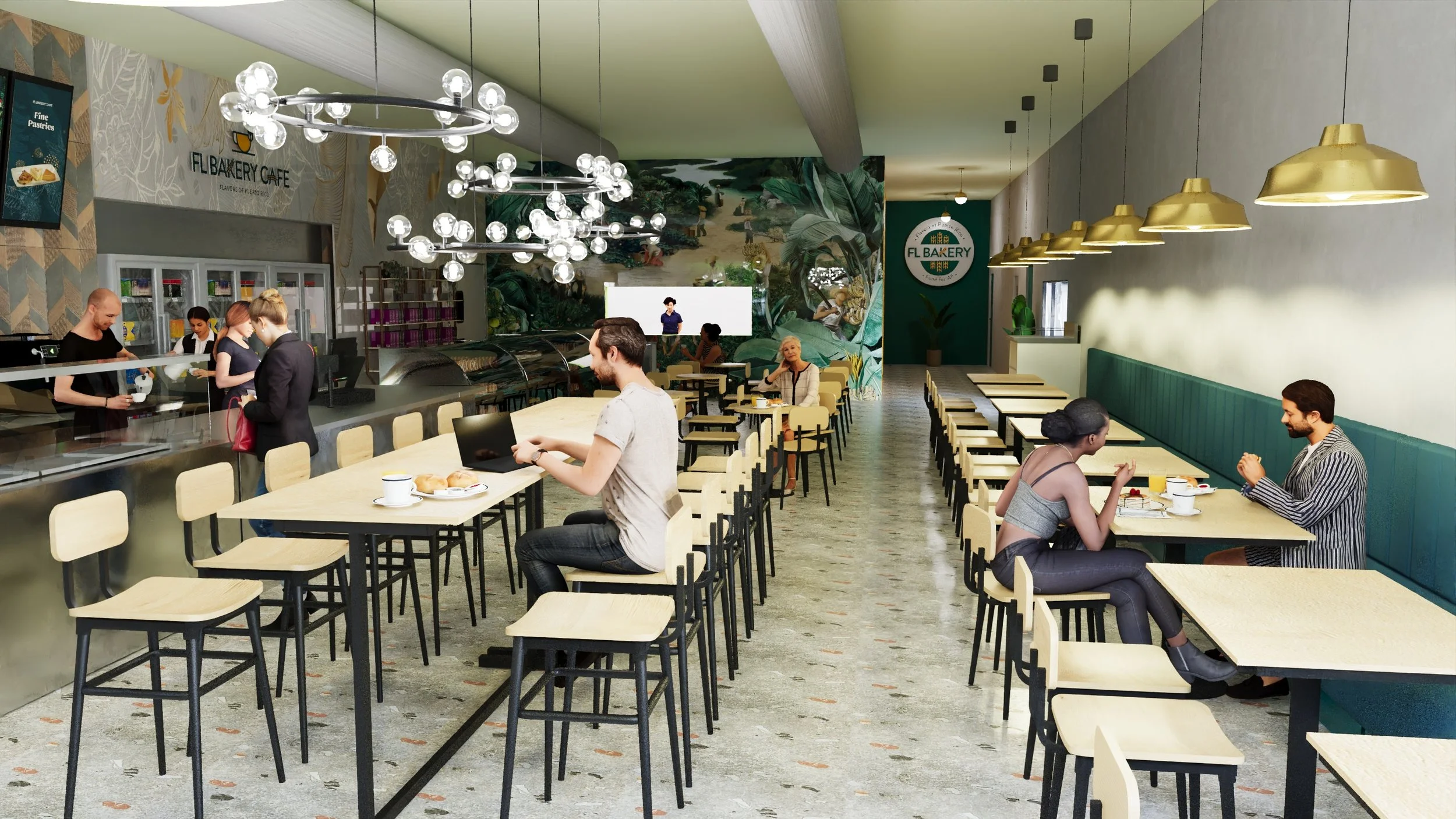
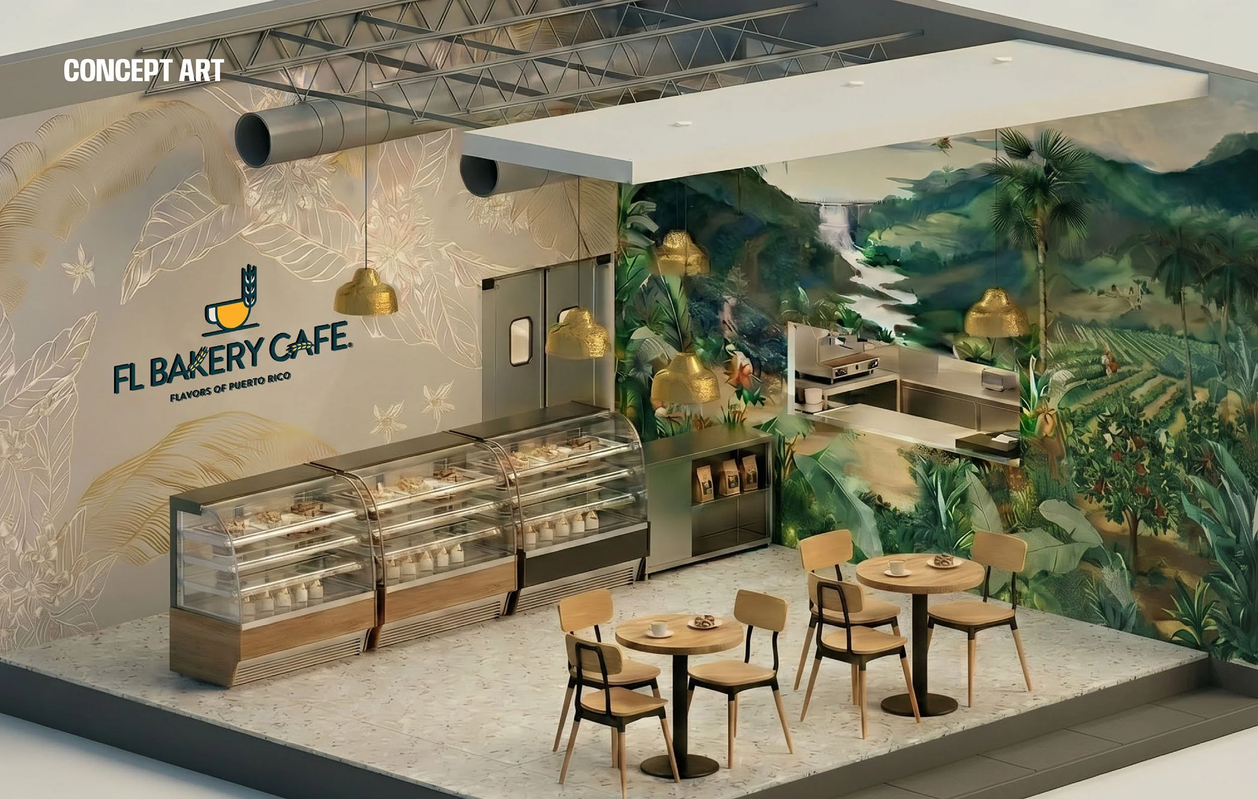
FL Bakery Cafe in St Cloud
One location can survive on instinct.
The owner is present.
Decisions are made quickly. A sign can be adjusted, a menu redesigned, a wall repainted or a new promotion
created without necessarily considering how that decision affects an entire system.
Then comes the second location.
And the third.
Perhaps a new market.
A different building.
A drive-through.
A smaller footprint.
A location hundreds or thousands of miles away.
Suddenly, decisions that once seemed individual have to work together.
That is when branding stops being primarily about identity and begins functioning as infrastructure.
At Candela Creative Group®, we have spent more than 25 years designing brands across physical and digital environments.
In restaurant and hospitality work, some of the most complex projects are not necessarily the largest spaces.
They are the brands that must remain recognizable while adapting to different locations, audiences, buildings and operational realities.
The question becomes:
How do you create a restaurant experience that can change without becoming a different brand every time it changes?
That is where the real work begins.
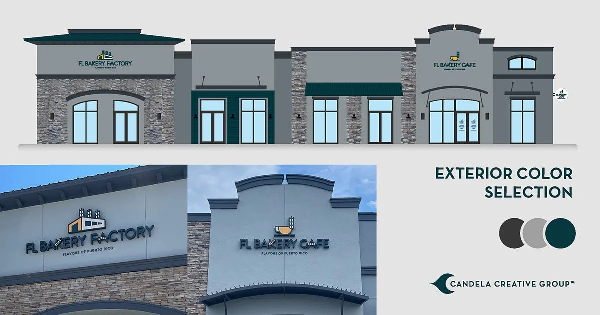
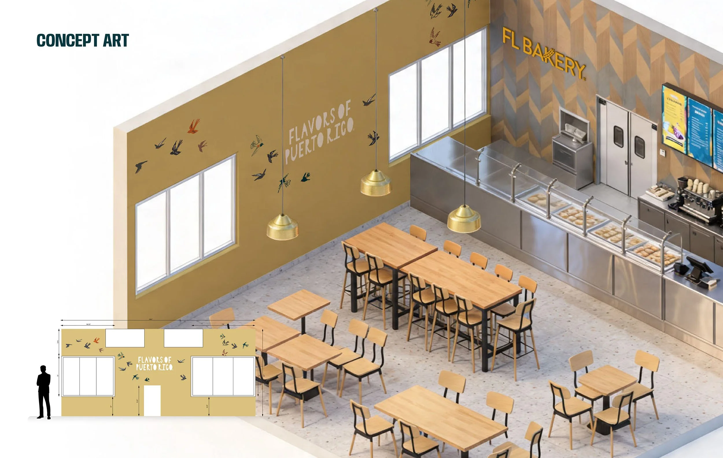
FL Bakery Factory & Cafe Exterior Design
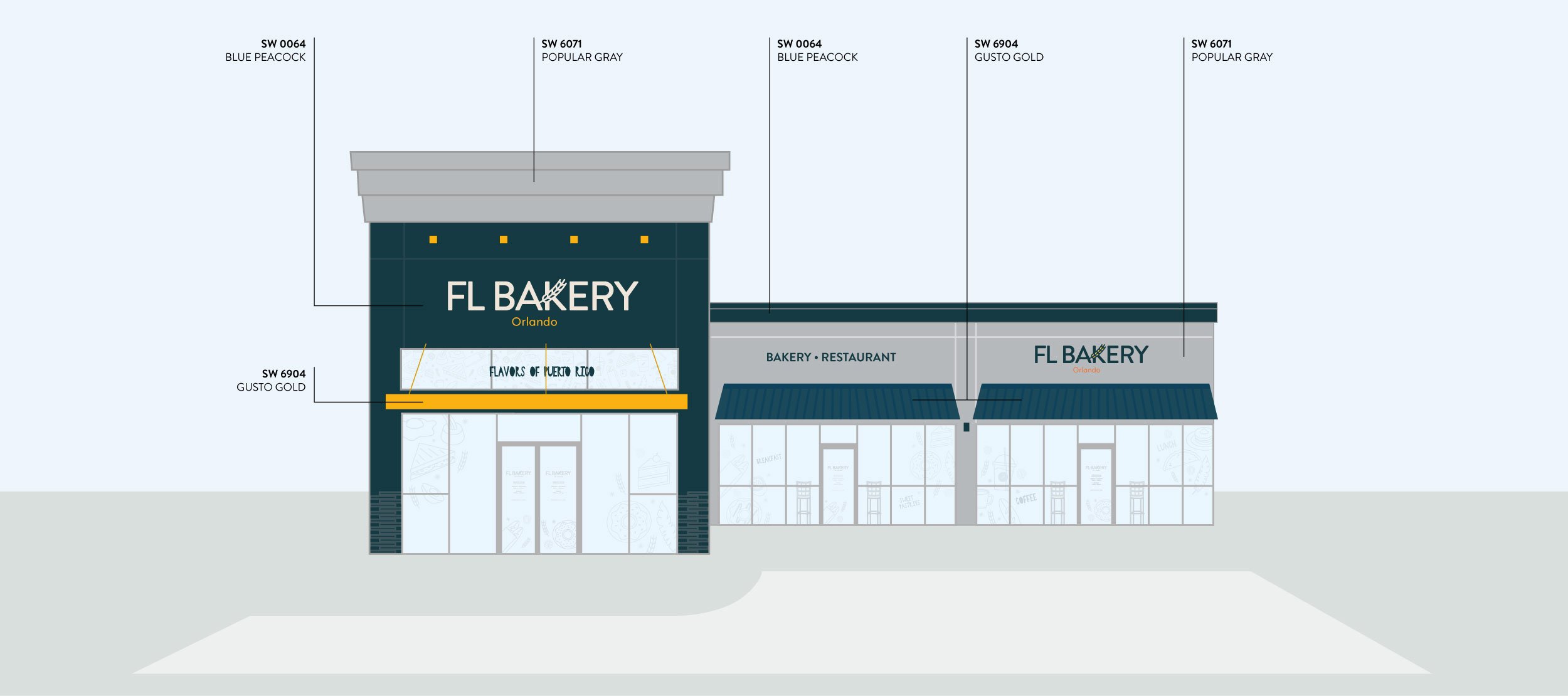
FL Bakery Semoran -Exterior Design
THE LOGO IS ONLY THE BEGINNING
A visual identity establishes recognition.
But customers rarely experience a restaurant as a logo in isolation.
They experience the building from the road.
The entrance.
The exterior sign.
The colors.
The menu. The counter.
The wayfinding.
The packaging they carry home.
The employee uniform.
The website they visited before arriving.
The ordering interface.
The drive-through.
The photography.
The language on a wall.
The receipt.
The social post they encounter three days later.
Each is a separate design problem.
To the customer, however, they are one experience.
That distinction is fundamental to the way we approach restaurant branding.
The objective is not to create a collection of attractive branded objects.
It is to establish a visual, spatial and operational language strong enough
to connect hundreds of individual decisions.
START WITH THE SYSTEM, NOT THE SPACE
One of the easiest mistakes in restaurant development is designing each
location as an isolated project.
The building begins dictating the brand.
A particular wall needs something, so a graphic is created.
There is an empty area over the counter, so another element is added.
A menu board has an unusual dimension, so it receives a new treatment.
The next location presents completely different conditions, and the process starts again.
Eventually, every location may contain the logo and the same corporate colors,
but they no longer feel like the same brand.
A scalable approach reverses that relationship.
Before asking what should happen on a particular wall, we ask:
What are the recognizable elements of this brand?
Which elements must remain constant?
Which can adapt?
Which visual devices belong uniquely to the brand?
How should typography behave?
How does photography work?
How do illustrations work?
What is the hierarchy of information?
What should a customer recognize before they even see the logo?
These decisions create a vocabulary.
The individual restaurant then becomes one expression of that vocabulary.
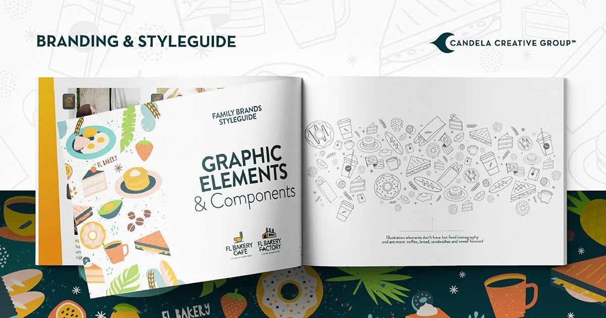
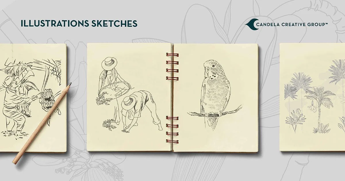
DESIGNING FOR RECOGNITION
Strong restaurant brands have recognizable assets beyond their logos.
Color can become one.
Typography can become another.
A pattern, illustration system, photographic language, material, architectural detail or
characteristic way of presenting information can gradually become proprietary territory.
The goal is not repetition for repetition's sake.
It is recognition.
Ideally, a customer should be able to encounter a piece of packaging, a menu, a section
of a storefront or even a small digital advertisement and understand which brand it belongs
to before consciously searching for the logo.
That level of recognition does not happen through decoration.
It comes from systems.
THE SPACE IS PART OF THE IDENTITY
For restaurant brands, identity eventually becomes physical.
Typography becomes signage.
Color becomes material.
Graphics become walls.
Brand hierarchy becomes wayfinding.
Illustration becomes environmental storytelling.
The identity begins occupying space.
That transition requires a different kind of thinking than graphic design alone.
A two-dimensional composition can be viewed all at once.
A restaurant cannot.
Customers encounter it sequentially.
They see the building from a distance.
They approach.
They look for an entrance.
They decide where to order.
They search for a menu.
They navigate toward pickup, seating, restrooms or an exit.
Every stage introduces communication.
The environment therefore has two responsibilities: it must express
the brand and it must help the customer understand the space.
The strongest branded environments accomplish both simultaneously.
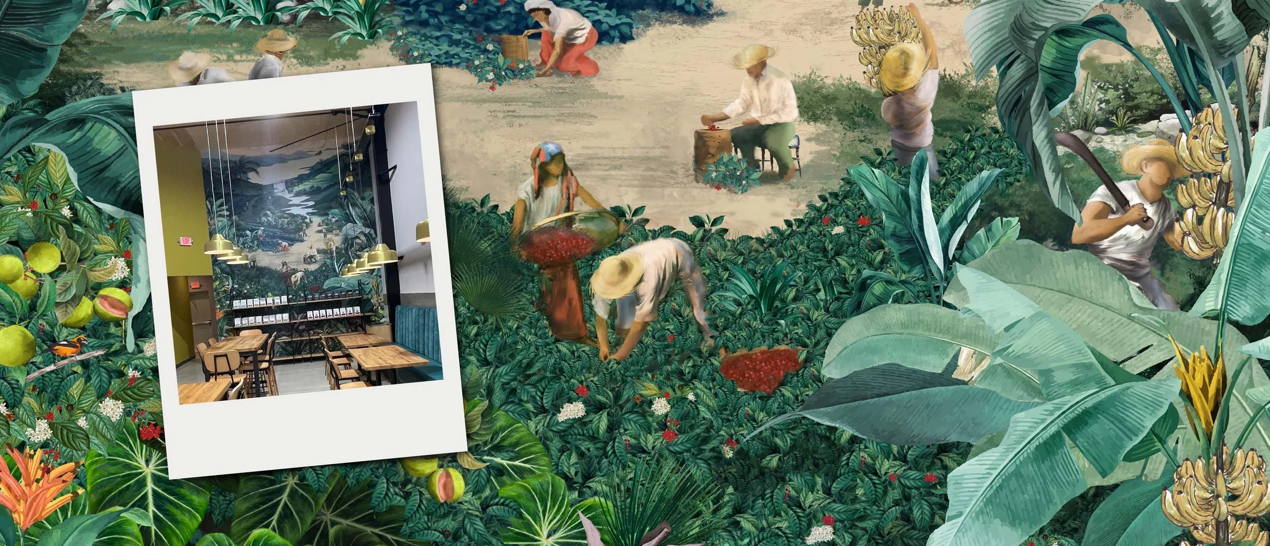
FL BAKERY Original Brand Mural in St Cloud, Florida
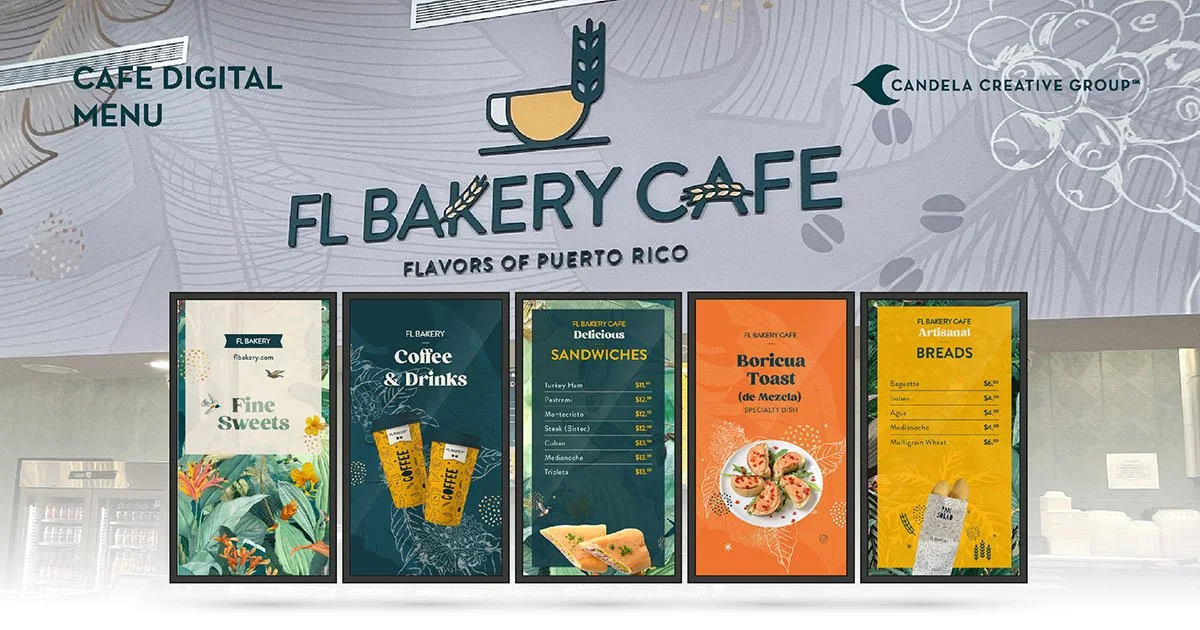
THE MENU IS AN INFORMATION SYSTEM
Few pieces of restaurant design are as operationally important as the menu.
A menu is not simply a branded list of products.
It is an information hierarchy that has to communicate quickly, support purchasing
decisions, accommodate pricing changes, introduce new products and function
within the realities of the restaurant.
The design questions are practical.
What does the customer need to understand first?
How many decisions are we asking them to make?
Which products require photography?
Which items should receive visual emphasis?
How will seasonal offerings appear?
What happens when prices change?
Can someone read it from the actual ordering distance?
A beautifully designed menu that slows ordering or confuses customers has failed part of its job.
Brand expression and operational performance have to coexist.
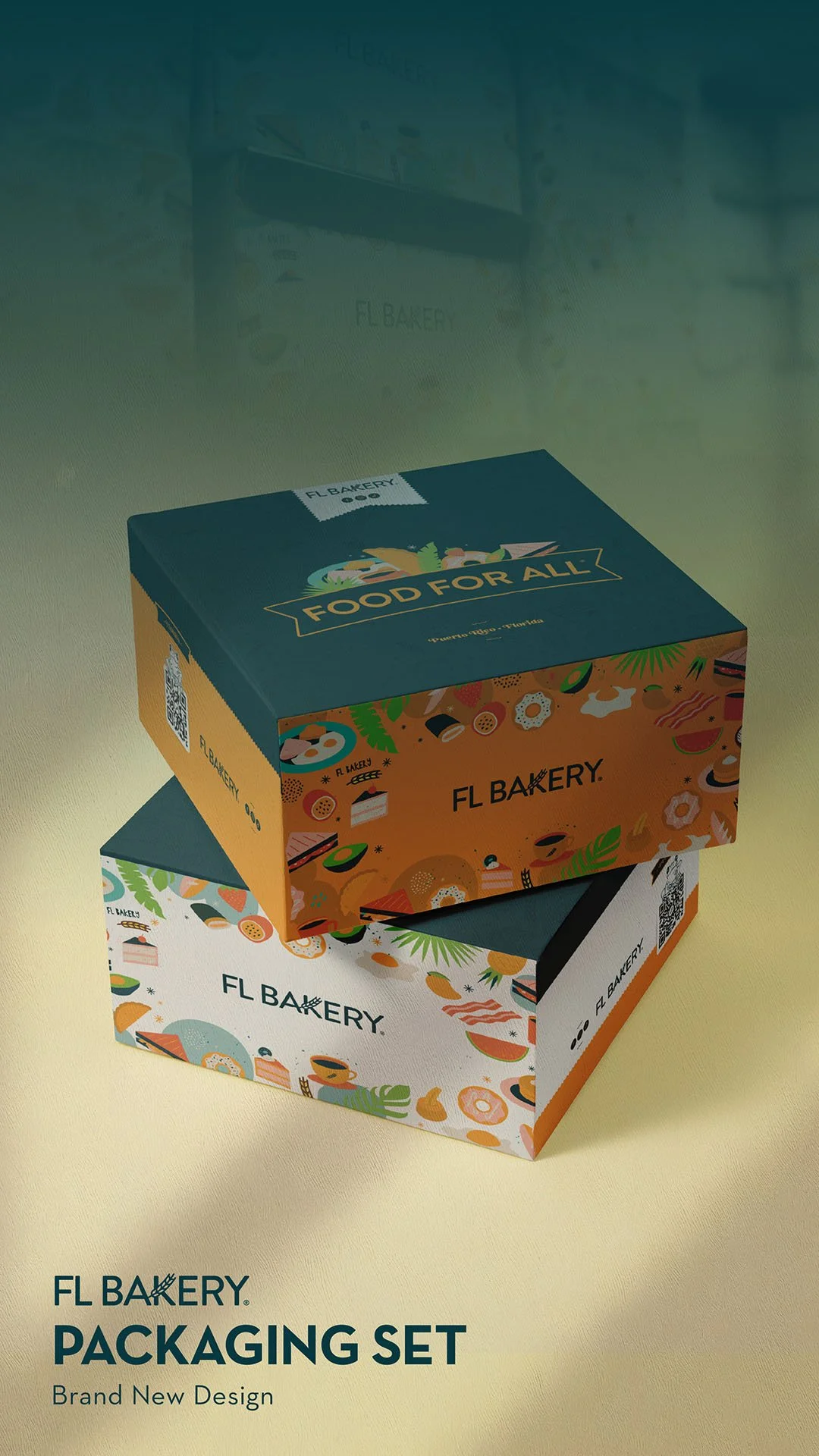
FL Bakery Packaging Design
PACKAGING TAKES THE BRAND OUTSIDE THE BUILDING
Packaging has an unusual role in a restaurant ecosystem.
It leaves.
A cup walks through a shopping center.
A bakery box arrives at an office.
A bag sits inside someone's car.
A catering package enters a meeting.
For a period of time, the customer becomes the distribution system for the brand.
That makes packaging both a functional object and a communication opportunity.
But the same principle applies here: every object does not need to contain every piece of the identity.
A strong system allows the brand to be reduced.
Sometimes a color is enough.
Sometimes typography.
Sometimes an illustration.
Sometimes the logo.
The power comes from having enough recognizable elements to make those decisions intentionally.
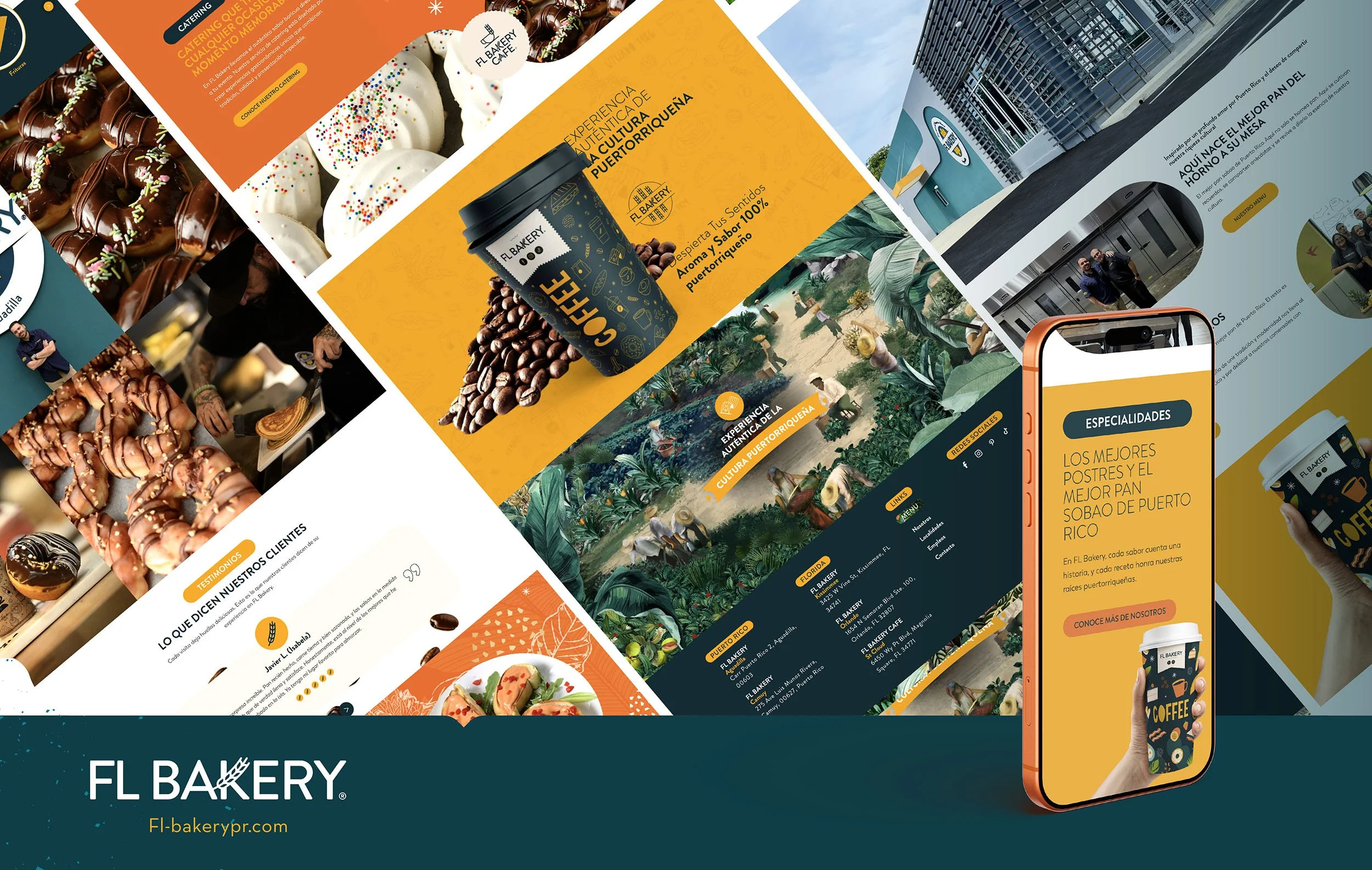
THEN THE BRAND BECOMES DIGITAL
The restaurant experience increasingly begins before the customer reaches the restaurant.
Search.
Maps.
Website.
Menu.
Social media.
Online ordering.
Delivery platforms.
Promotions.
The physical and digital identities cannot behave as unrelated versions of the company.
A customer who discovers a restaurant online and then visits the physical location should
feel continuity between those experiences.
The scale changes.
The interaction changes.
The underlying brand should not.
This is why we increasingly think about restaurant identity, spatial design and digital systems
as interconnected disciplines rather than separate deliverables.
THE SECOND REGION CHANGES THE QUESTION
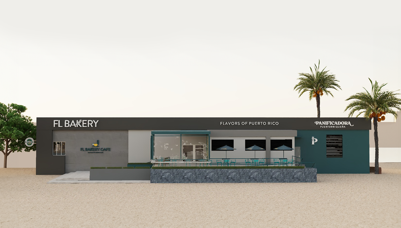
FL Bakery Camuy
The first restaurant asks:
What should this place look like?
A growing restaurant brand has to ask a different question:
What makes every future location unmistakably ours?
Those questions lead to very different design decisions.
A second-generation location may occupy a completely different building.
Ceiling heights change.
Facades change.
Municipal signage regulations change.
Customer flow changes.
Budgets change.
Markets change.
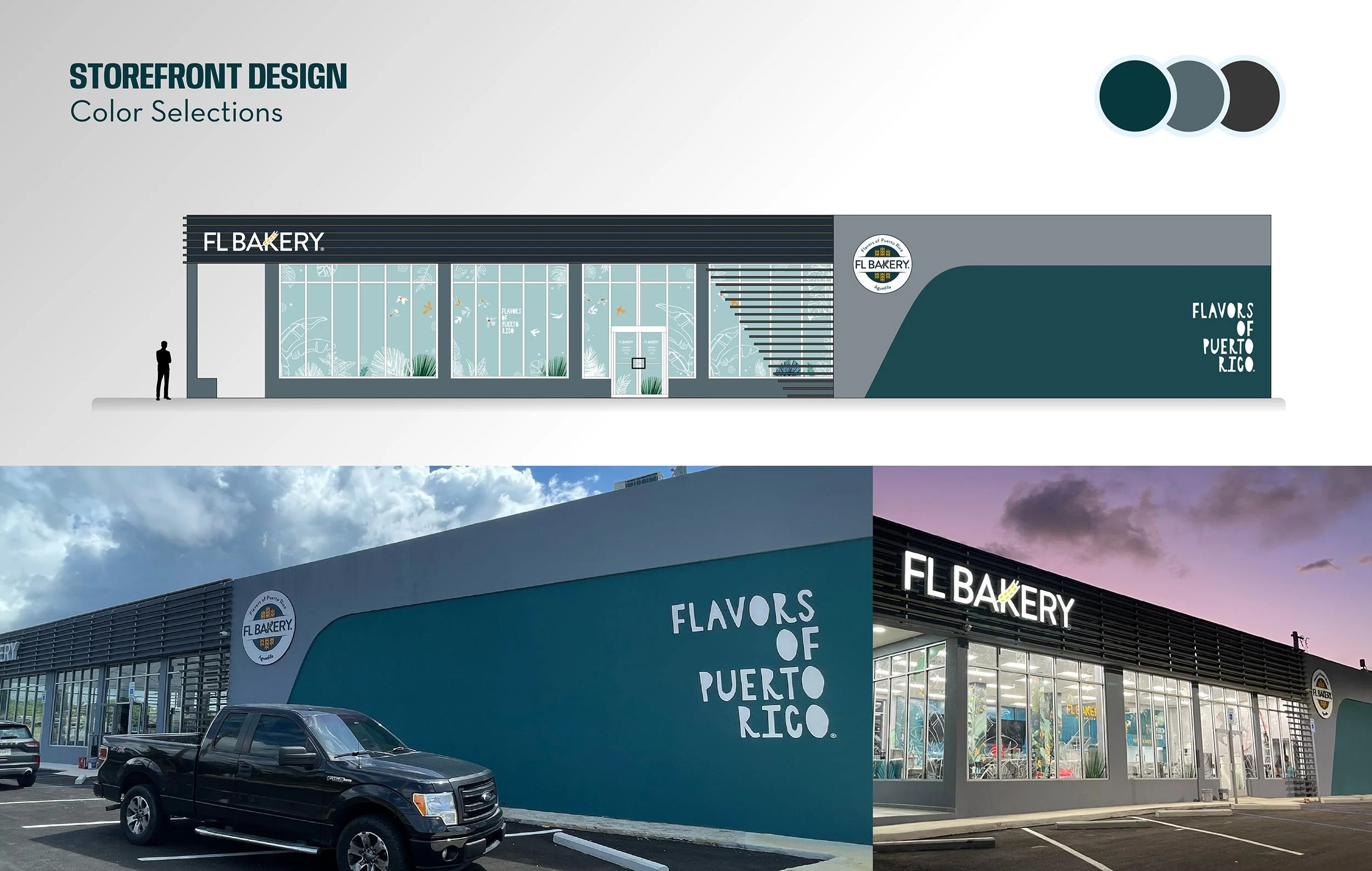
FL Bakery Aguadilla Exterior
In the case of brands operating across regions, culture and customer expectations can change as well.
Trying to reproduce the first location exactly is rarely the answer.
Instead, we identify what we call the brand constants and the brand variables.
Constants protect recognition.
Variables allow adaptation.
The identity might remain constant while the architecture changes.
A graphic language might remain recognizable while individual illustrations respond to a particular community.
Materials might shift while the color hierarchy remains intact.
The restaurant evolves.
The brand remains recognizable.
LOCAL RELEVANCE WITHOUT BRAND FRAGMENTATION
Regional expansion introduces another challenge.
A restaurant should not feel indifferent to the community in which it operates.
But localization can easily become fragmentation.
Every location cannot reinvent the company.
The opportunity is to create a system with enough structure to maintain identity and
enough flexibility to acknowledge place.
We have encountered this directly while developing restaurant environments
across Florida and Puerto Rico.
Different markets, building conditions and audiences require adaptation.
The solution is not choosing between consistency and individuality.
It is designing a system capable of supporting both.

THE DETAILS THAT NOBODY CALLS BRANDING
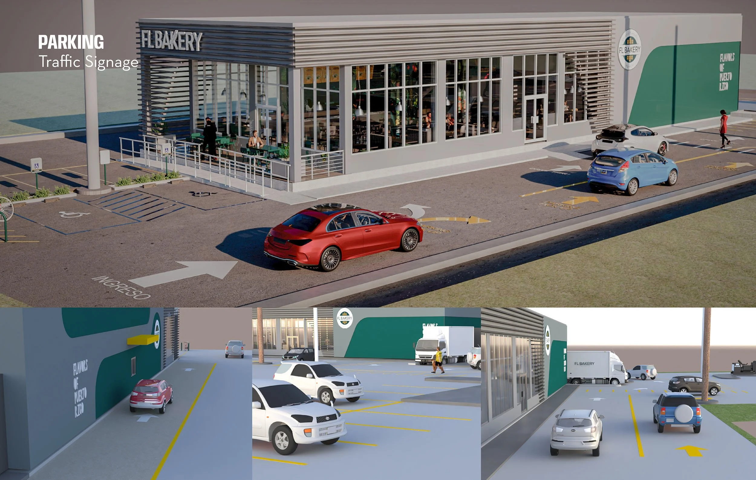
Some of the most consequential brand decisions are rarely introduced as branding projects.
Where should customers park?
How visible is the entrance?
Can someone understand the drive-through before reaching the menu?
Where does pickup happen?
What information belongs on the door?
What happens when the restaurant is closed?
Where do delivery drivers go?
How are temporary promotions displayed without destroying the permanent environment?
Where does a seasonal sign belong?
What happens when operations introduce something the original design never anticipated?
These may sound like small decisions.
Multiply them across five, ten or fifty locations and they become the brand.
That is why restaurant branding cannot end with a style guide.
The system has to survive contact with the real world.
CONSISTENCY DOES NOT MEAN MAKING EVERYTHING THE SAME
This may be the most important distinction.
Consistency is not duplication.
The objective of a scalable restaurant brand is not to make every building identical.
It is to make every experience related.
A strong identity should be able to expand and contract.
It should work on a twenty-foot facade and a two-inch label.
It should accommodate a flagship location and a small-format store.
It should survive a renovation.
It should support new products.
It should adapt to technologies that did not exist when the first location opened.
And it should still feel unmistakably like the same company.
That is what makes a brand system valuable.
BRANDING BECOMES BUSINESS INFRASTRUCTURE
When restaurant branding is treated as a one-time expense, businesses
tend to accumulate design decisions.
A new menu here.
A sign there.
A promotional graphic from one vendor.
Packaging from another.
A website update.
A remodeled location.
A new store.
Each decision may solve the immediate problem while slowly weakening the larger system.
Growing brands need another model.
Branding has to be maintained much like the other infrastructure supporting the business.
Not because everything needs constant redesign, but because every new business decision
creates another point where the brand can either become stronger or more fragmented.
The purpose of a brand system is to make those decisions easier.
BUILDING SOMETHING THAT CAN GROW
The best time to think about scalability is not when a company reaches its tenth location.
It is when the possibility of the second begins to feel real.
Because the real measure of a restaurant identity is not simply how beautiful the first location looks on opening day.
It is what happens afterward.
Can another architect understand it?
Can another fabricator reproduce it?
Can the marketing team extend it?
Can a new location adapt it?
Can employees use it?
Can customers recognize it?
Can the system absorb change without losing itself?
A successful restaurant brand is not a finished composition.
It is a framework for making thousands of future decisions.
And when that framework is designed correctly, growth does not have to dilute the brand.
It can make the brand stronger.
Candela Demarco— Candela Creative Group®
Branding Strategies + Spatial Design + Digital Systems
Over 25 Years of Excellence
When Original Artwork Becomes Part Of A Brand
Candela Creative Case Studies - El Mesón Sandwiches
How an original art commission for El Mesón Sandwiches evolved into a visual language spanning architecture, packaging, promotions and new customer experiences.

El Mesón Sandwiches, San Patricio Plaza
Around 2015, Candela Creative Group® received an unusual call from the marketing team at El Mesón Sandwiches.
They weren't looking for a new logo. They weren't asking for a restaurant redesign or a new advertising campaign.
They wanted original artwork.
The team had seen an abstract painting in Europe that stayed with them and imagined creating something with a similar artistic presence for their restaurants—something contemporary and expressive, but unmistakably their own.
They came to us after seeing work we had created for museums, educational institutions and the University of Puerto Rico, where illustration, environmental design and storytelling often intersect.
What began as an art commission would eventually become something neither of us had fully anticipated: a visual language that continues to evolve with El Mesón more than a decade later.
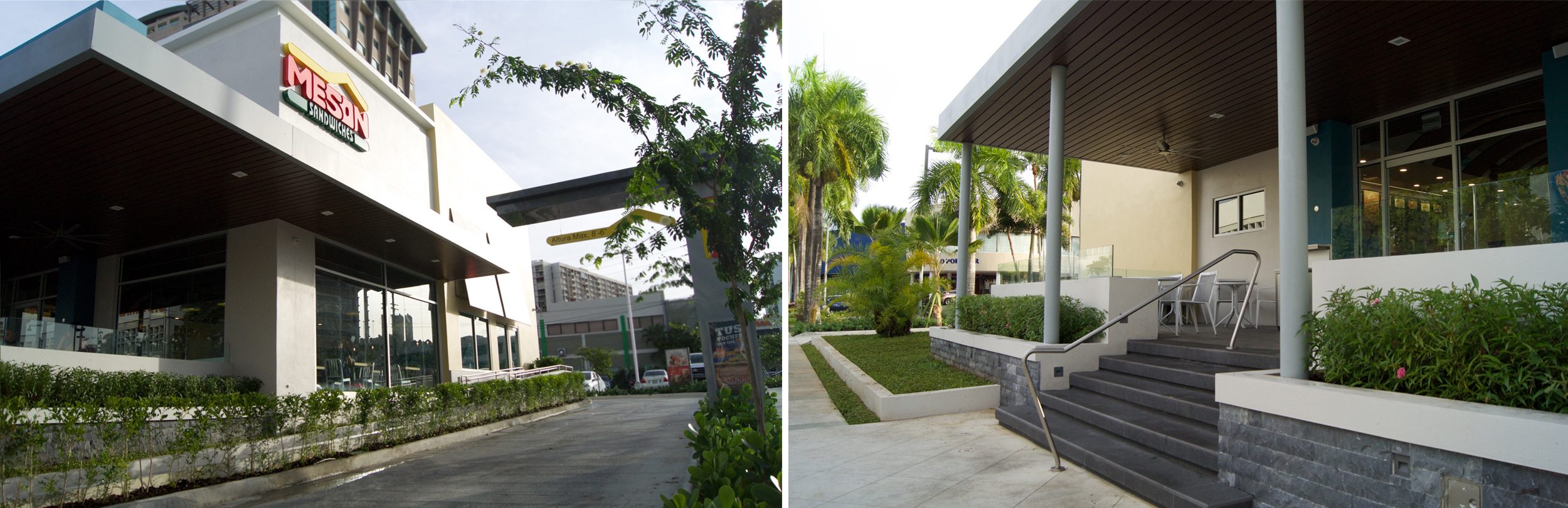
El Meson Sandwiches - San Patricio
WORKING WITH A BRAND THAT ALREADY HAS HISTORY
El Mesón isn't a brand that needed a story invented for it.
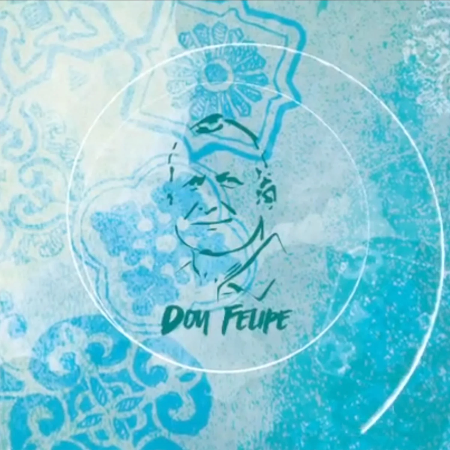
The company began in Aguadilla, Puerto Rico, in 1972, when founder Felipe Pérez opened a small restaurant serving breakfasts, coffee and sandwiches. Fifteen years later, its second restaurant opened at Mayagüez Mall. Over the decades, El Mesón grew into one of Puerto Rico's most recognized restaurant companies and eventually expanded into Florida. Today, the company describes its footprint as more than 40 restaurants. Meson Sandwiches
By the time we became involved, generations of customers already recognized its logo, restaurants, colors and food.
That history mattered.
There were aspects of the identity we believed could evolve, but a rebrand wasn't what the family wanted—and it wasn't what we had been hired to do. The existing identity represented decades of recognition and a multigenerational business.
So instead of replacing it, we looked for a way to add to it.
That distinction became fundamental to the project.
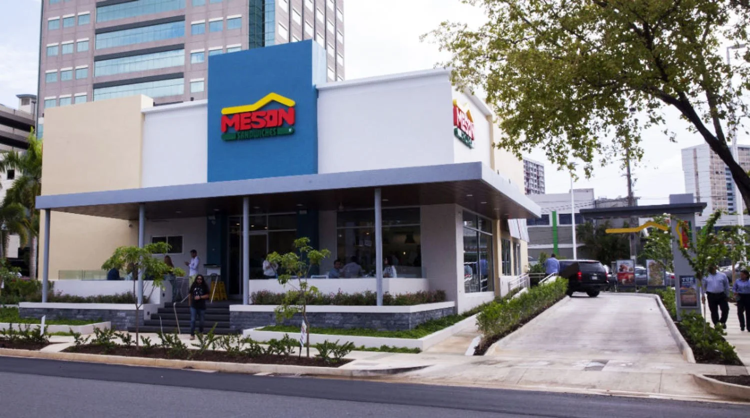
El Meson Sandwiches
FINDING A NEW VISUAL TERRITORY
At the time, much of El Mesón's established visual environment relied on browns, black, yellow and other warm tones. The artwork gave us an opportunity to introduce a different chromatic presence without changing the core identity.
Blue became an important part of that new territory.
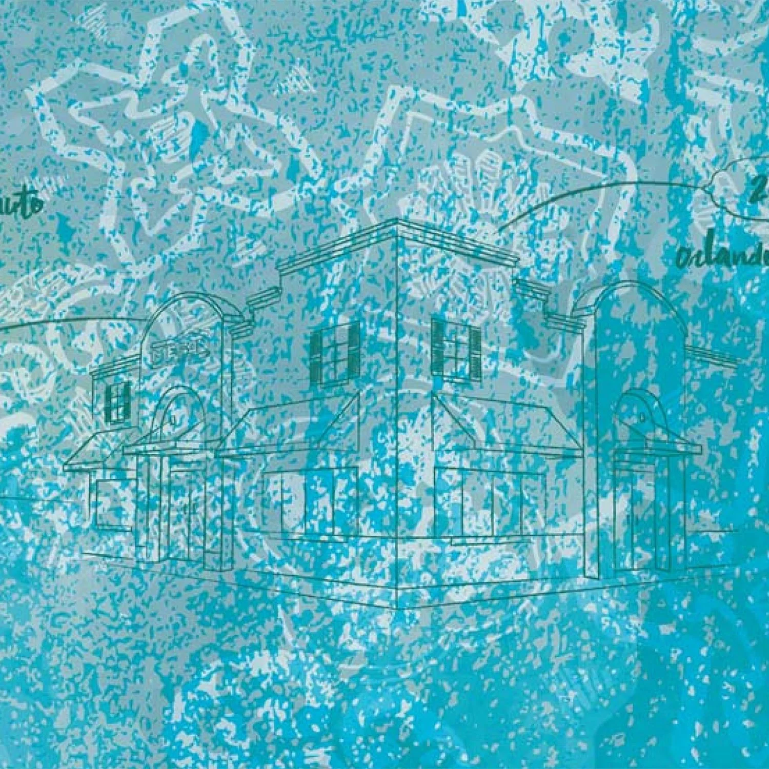
We also looked at visual elements that already existed within the restaurants, including patterns found in their tilework. Rather than reproducing those motifs literally, we fragmented and abstracted them, building layers of color, texture, shadows and shapes.
The intention was deliberately not folkloric.
El Mesón is deeply Puerto Rican because of where it comes from and the history it carries. It didn't need a collection of obvious cultural symbols to establish that connection. The client wanted something abstract, contemporary and artistic.
So the relationship to the brand had to happen in a quieter way.
Some references are so quiet that most customers may never notice them. Hidden within one of the patterns, for example, is a cross incorporated at the family's request—a personal reference to their faith, intended to be part of the artwork without defining it.
Those details became part of a composition that could feel abstract from a distance while revealing considerably more when experienced up close.
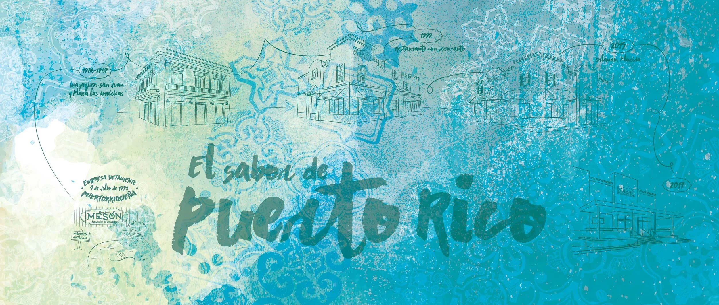
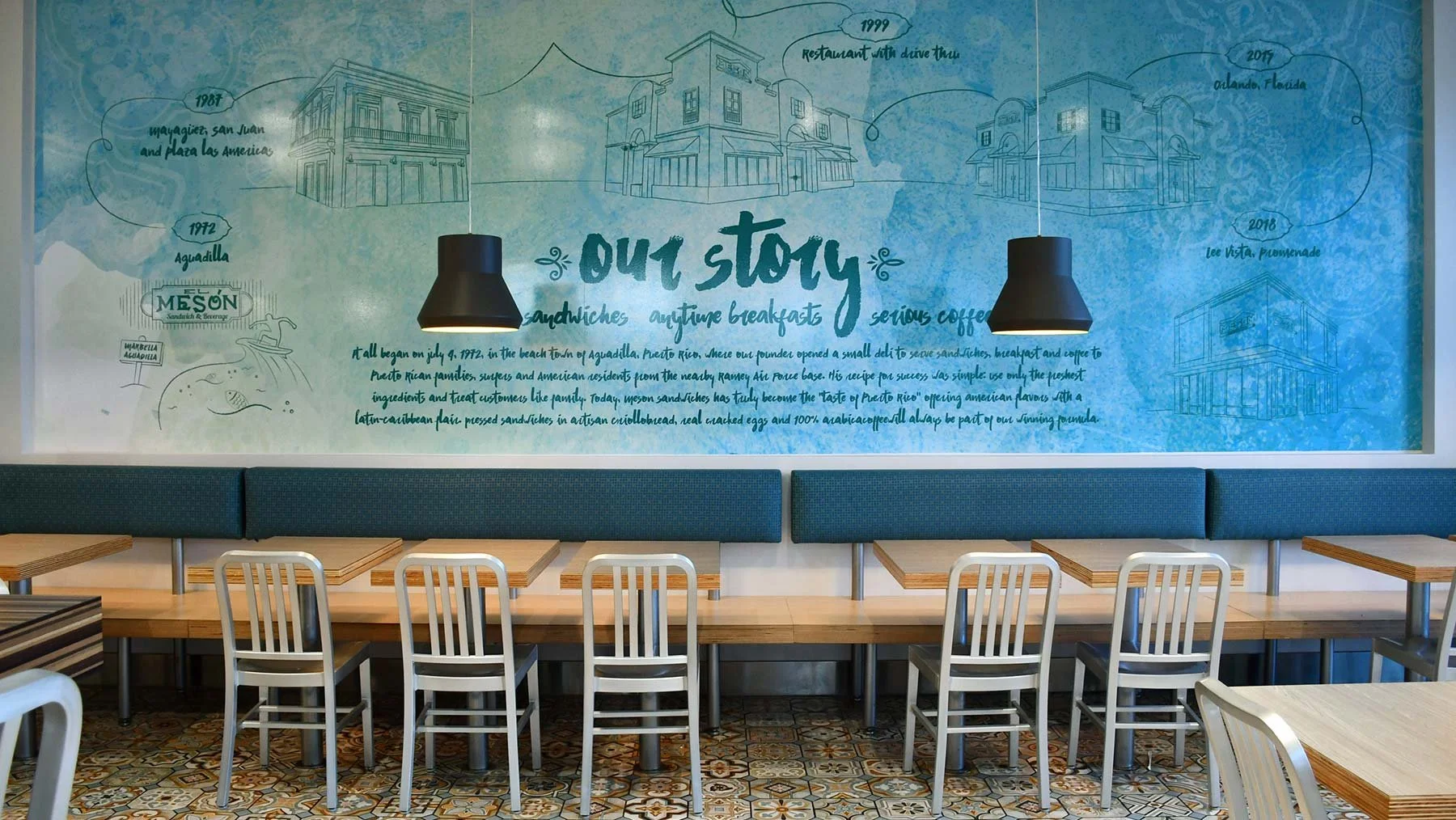
ILLUSTRATING A HISTORY
As the artwork developed, another opportunity emerged.
El Mesón had a remarkable history to tell.
From its beginnings in Aguadilla in 1972, the company had grown through a series of restaurants and architectural moments that customers and employees recognized as part of its evolution.
We began drawing them.
Selected restaurants, dates and milestones became illustrations layered into the artwork, transforming what could have remained purely abstract into something more particular to El Mesón.
The challenge wasn't to document everything. It was to determine which moments could carry the story.
Architecture became especially useful. An illustrated building could represent a location, a period of growth and a memory simultaneously. Dates provided a subtle chronology, while the surrounding abstraction prevented the artwork from becoming a conventional corporate timeline.
From across a restaurant, it could still be experienced simply as art.
Look closer, and the company's history begins to appear.
A TIMELINE THAT ISN'T FINISHED
One of the most interesting things about the project is something we couldn't have planned when we created the first artwork:
El Mesón kept growing.
The company opened its first Florida restaurant at the Florida Mall in Orlando in 2015 and continued expanding its presence in Central Florida. Meson Sandwiches
As new restaurants have opened, new architecture has had the opportunity to become part of the illustration. We have continued drawing selected buildings and incorporating them into updated compositions.
Not every location can appear in every mural, nor should it. The objective isn't to create an exhaustive map.
It is an evolving visual history.
In that sense, the timeline was never really completed.
The company continues writing it.
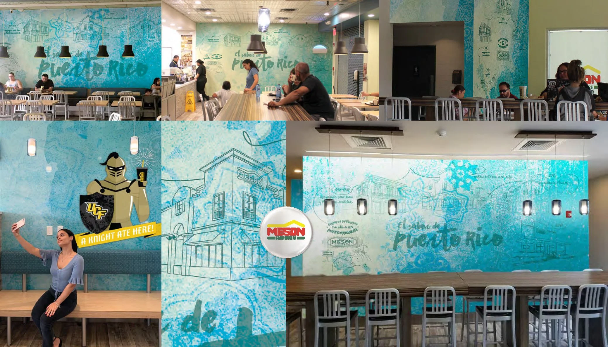
El Meson featuring several locations in Puerto Rico and Florida
WHEN THE ARTWORK MOVED BEYOND THE WALL
As the illustration became part of the restaurant environment, elements of it also began finding their way into other expressions of the brand.
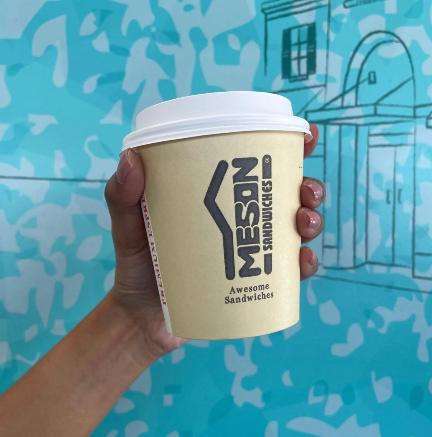
The abstracted tile patterns, illustrated timeline and expanded color palette have inspired applications across packaging—including bags and cups—as well as advertising and promotional pieces, particularly for holidays, anniversaries and special events.
This was an important evolution because the original artwork had never been conceived as a new identity system. Yet over time, it provided El Mesón with a broader visual vocabulary that could complement its established brand.
Color became part of that evolution.
Much of the visual communication we encountered when we first began working together was grounded in a concentrated palette of black, brown, yellow and red. The blues and additional hues developed through the artwork gave us opportunities to introduce more range into selected promotions while maintaining a relationship with the existing identity.
Sometimes that connection is direct, incorporating portions of the abstract patterns or elements of the illustrated history. Other times, it is simply the freedom to introduce a different combination of color, texture and layering.
The intention was never to replace the established visual language.
It was to give it more room to speak.
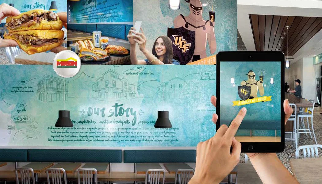
UCF Knight selfie wall illustrated by Candela Creative Group for El Mesón Sandwiches Lee Vista restaurant in Orlando, Florida.
DESIGNING FOR THE COMMUNITY AROUND THE RESTAURANT
Not every location needs to tell exactly the same story.
For El Mesón’s Lee Vista restaurant in Orlando, proximity to the University of Central Florida presented an opportunity to create something specifically for the community surrounding that location.
Candela Creative Group® was commissioned to develop an original illustrated selfie wall featuring the UCF Knight—integrating the university connection into the visual world we had already established for El Mesón.
The piece was designed to do more than decorate the restaurant. It created a destination within the space: a place where students, alumni and guests could photograph themselves, share the experience and document their visit to El Mesón.
The illustration sits against the familiar layered blue artwork, but introduces a completely site-specific character and message. Rather than asking the entire restaurant system to change, one moment within it was allowed to belong specifically to Lee Vista and its audience.
For a multi-location restaurant brand, we think that distinction matters.
Consistency builds recognition. Local relevance creates connection.
For the image
This photograph is exactly the image I would use directly beneath the section because it demonstrates the concept in use rather than merely showing the finished wall. Someone is actually taking the selfie the artwork was designed to encourage.
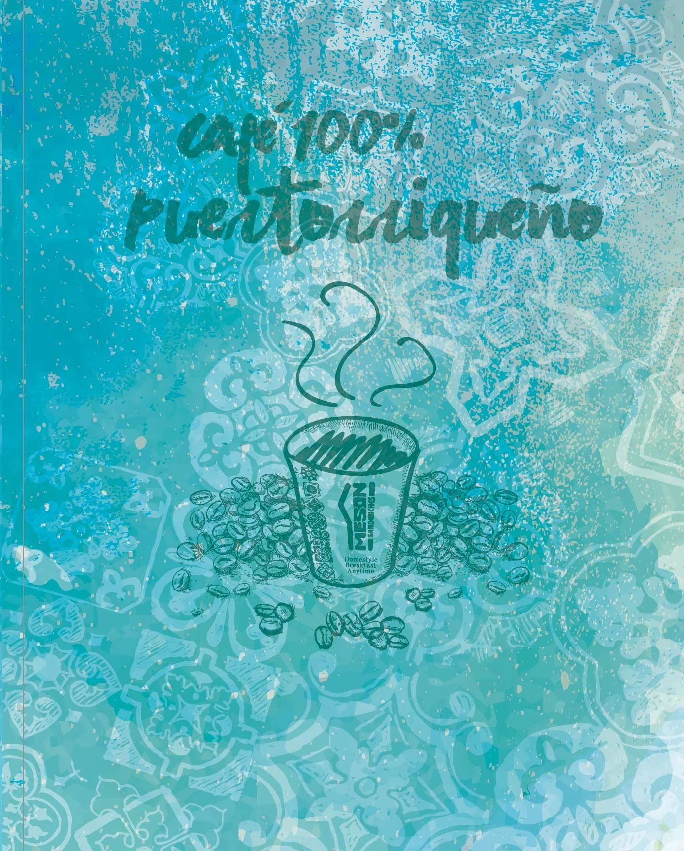
El Meson Artwork Vignettes
THE SAME ARTWORK SHOULD NOT MEAN THE SAME WALL
El Mesón began incorporating the artwork into additional restaurants, simply reproducing the original mural would have been the easiest solution.
It also would have been the wrong one.
Restaurant architecture changes dramatically from location to location. A long focal wall in one restaurant may become a narrow vertical surface in another. Windows, entrances, furniture, ceiling conditions, circulation and viewing distances all affect how artwork is experienced.
So each new application requires us to return to the composition.
The historical elements may remain recognizable, but the layers around them are adjusted. Shapes move. Color relationships change. Shadows are rebuilt. Portions become more or less prominent according to the architecture.
We have adapted the work for locations including Mayagüez, San Patricio, Aguadilla, San Germán, Sábalos and multiple restaurants in Florida, among others.
The objective isn't identical reproduction.
It is continuity without sameness.
That principle is essential when designing for multi-location brands. A system has to be recognizable enough to belong to the same company while remaining flexible enough to respond intelligently to different environments.
DESIGN DOESN'T END WITH THE FILE
Working at architectural scale has also taught us how easily good artwork can be compromised during production.
A printing process can shift a blue dramatically. A glossy material can completely change the character of artwork intended to have a matte, layered quality. Improper scaling can distort an illustration that was carefully composed for a particular wall.
Those aren't simply production problems.
They affect the design.
For some installations, achieving the intended color has required dozens of physical tests before approving final production.
Whenever possible, we remain involved through that process—reviewing proofs, communicating with fabricators, testing color, checking materials and overseeing installation.
Because the digital file isn't what the customer ultimately experiences.
The wall is.
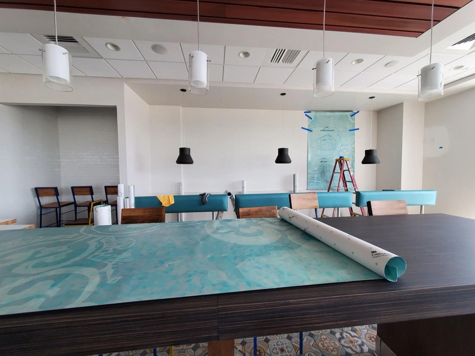
Illustration and color tests by Candela Creative Group for El Mesón Sandwiches restaurant in Orlando, Florida.
ALLOWING THE SYSTEM TO EVOLVE
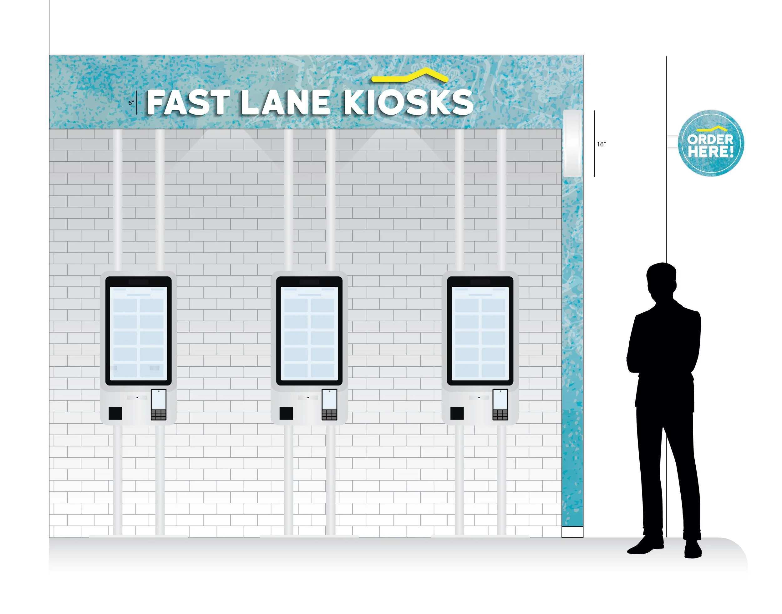
El Meson Lee Vista kiosks outline
More than a decade after the original commission, El Mesón's restaurants continue changing.
The relationship has evolved with them.
More recently, Candela Creative Group® was asked to design the environmental graphics and signage surrounding the brand's self-order kiosk areas. The kiosk equipment itself is supplied separately; our role is to make the area it occupies feel intentional within the restaurant environment.
We developed a detailed production style guide establishing dimensions, materials, Pantone specifications, signage and approved configurations so the system could be implemented consistently across different locations and production teams.
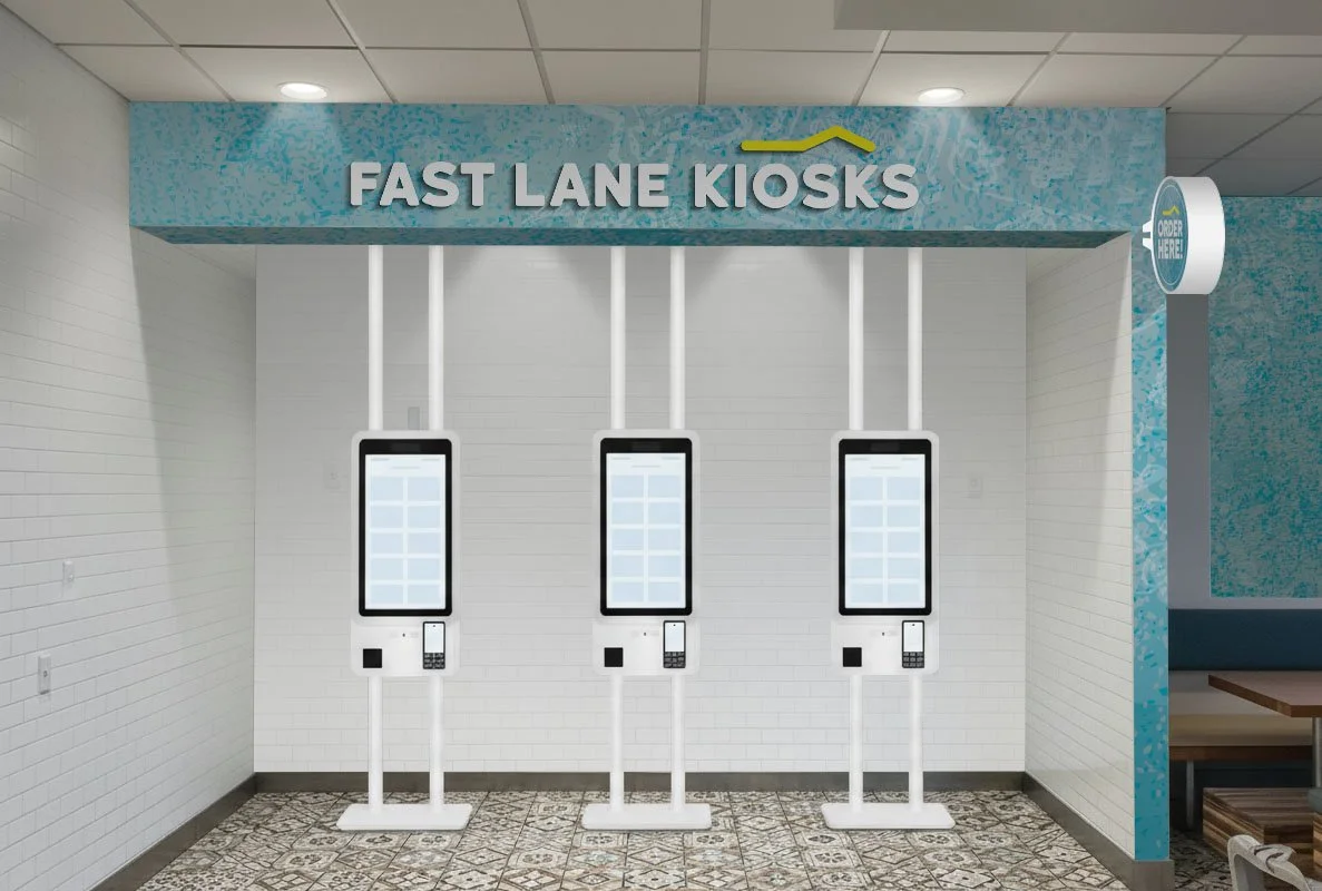
El Meson Lee Vista kiosks
Once again, architecture required flexibility.
Some restaurants call for a restrained white-wall configuration. Others allow the layered blue artwork to become a stronger part of the kiosk environment.
The result isn't one fixed design that has to be forced into every restaurant.
It is a controlled family of solutions.
The technology is new.
The principle behind designing for it is not.
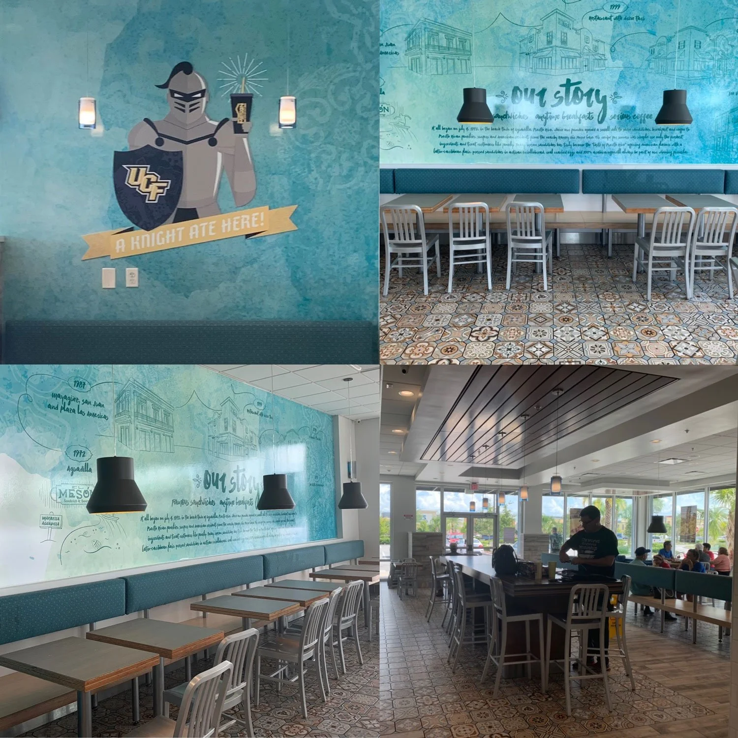
El Mesón Sandwiches Lake Nona restaurant in Orlando, Florida.
WHEN ARTWORK BECOMES SOMETHING MORE
There is one measure of this project's success that was never part of the original brief.
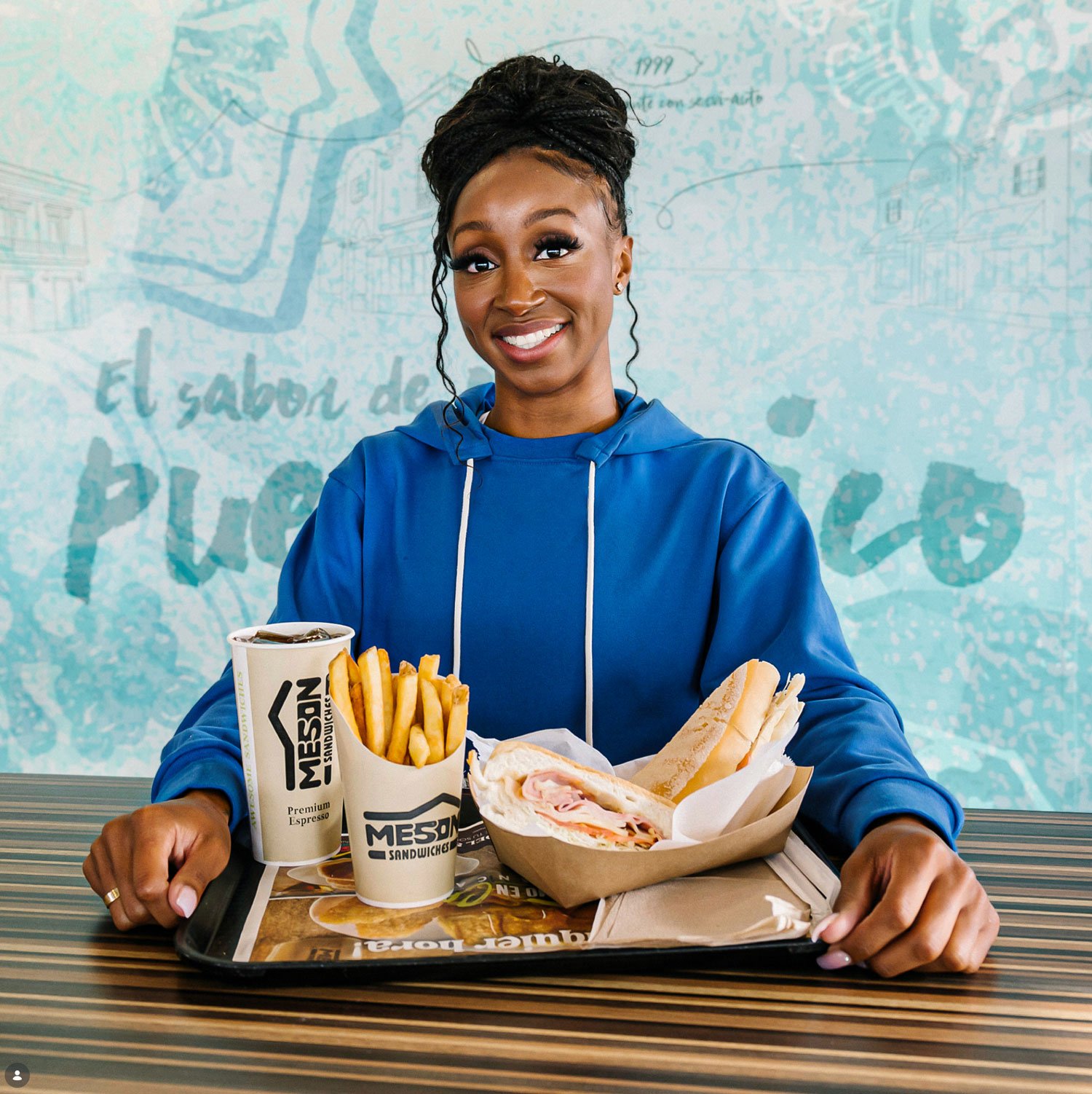
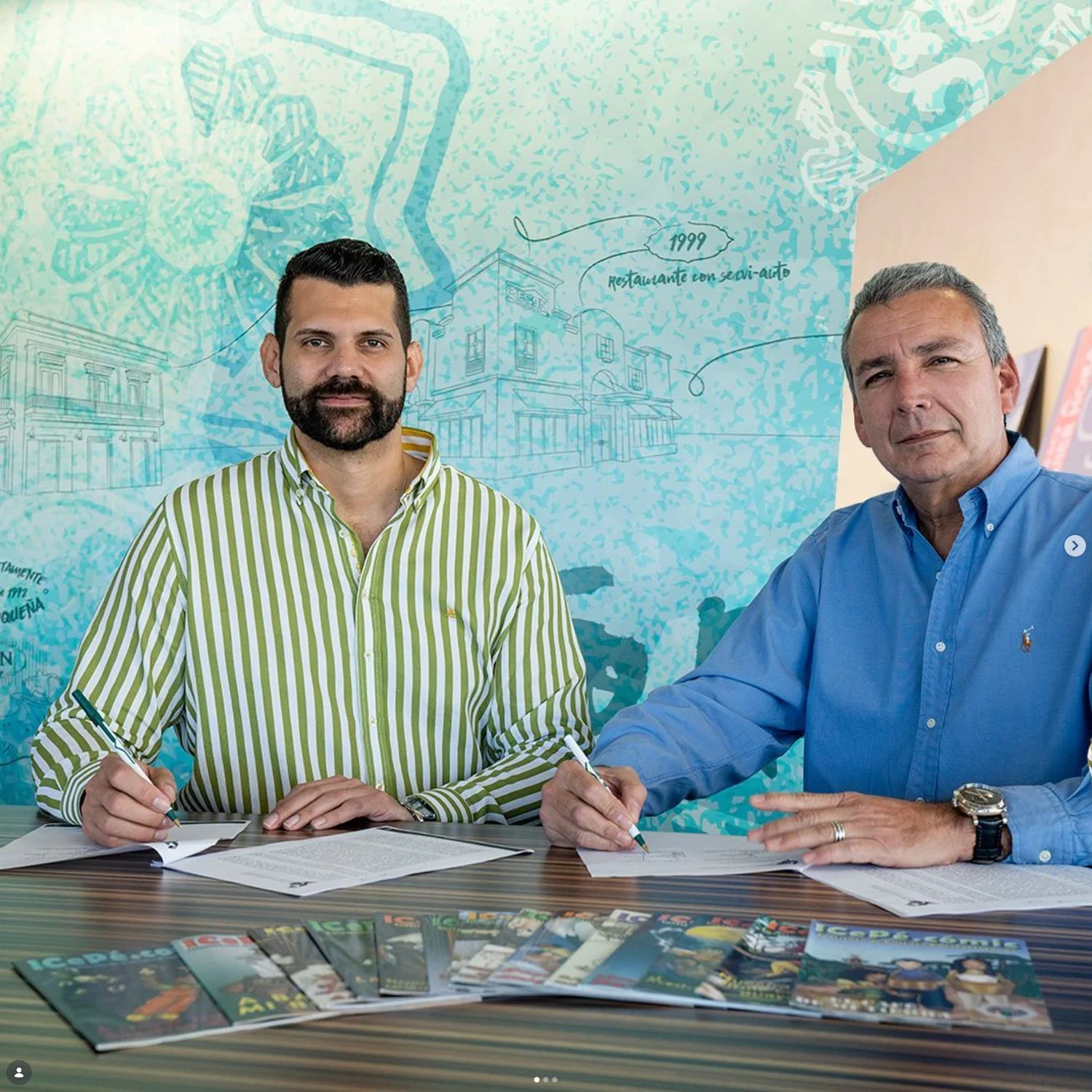
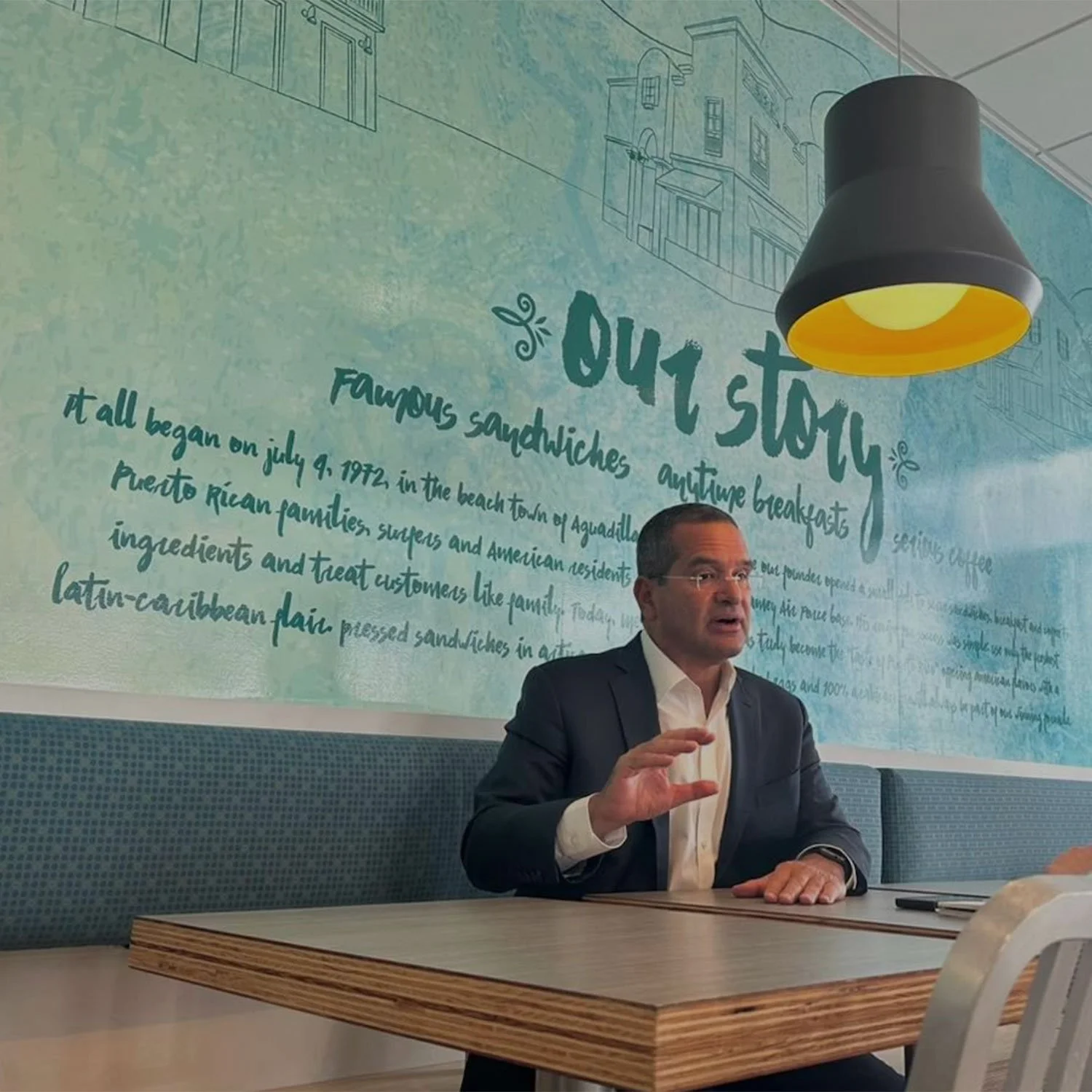
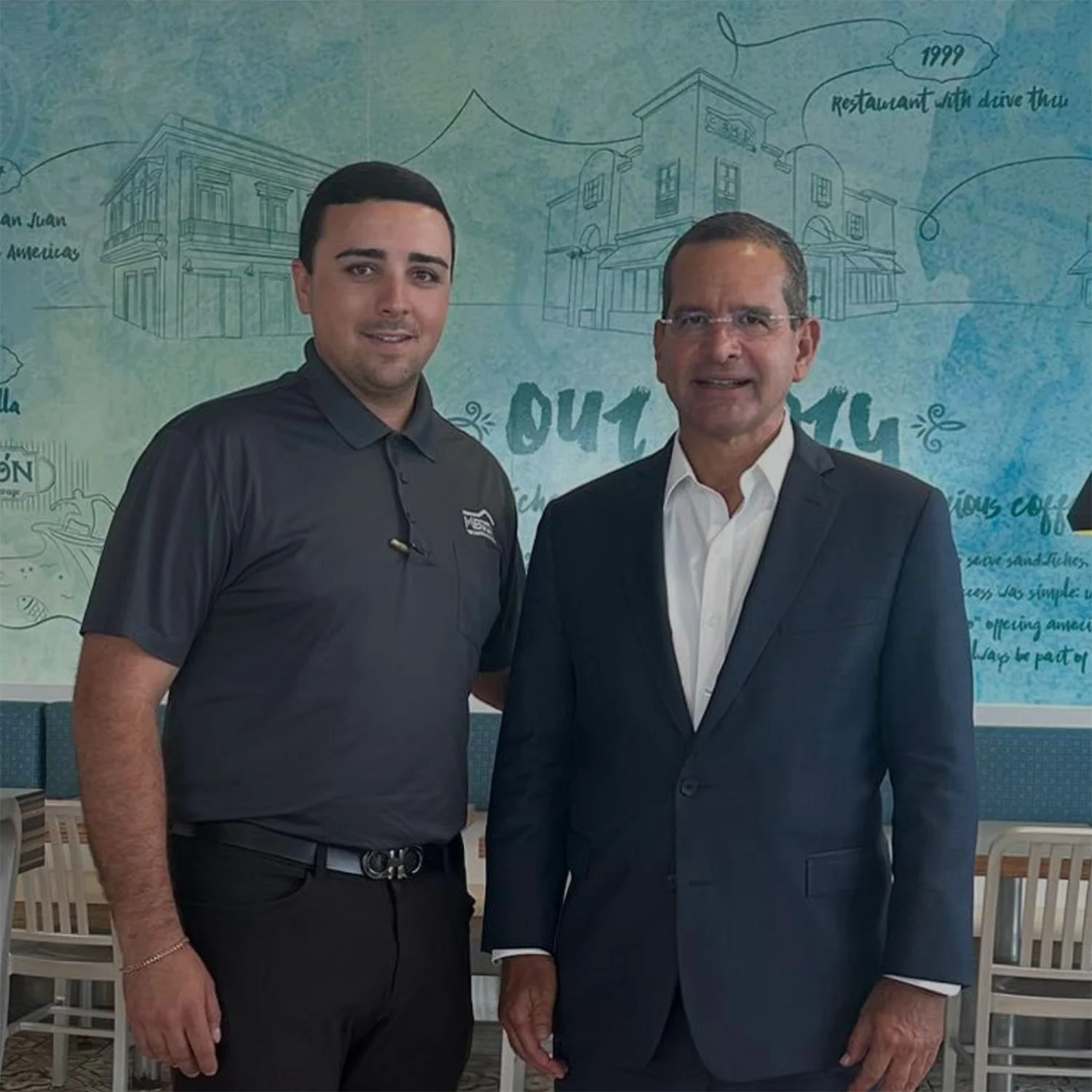
Over the years, we've noticed that when members of El Mesón's ownership or leadership are photographed or interviewed inside the restaurants, they frequently choose the mural as their backdrop.
We notice it because we remember when that wall was nothing more than artwork on our screens.
The mural was originally commissioned to represent the brand.
Somewhere along the way, it became a place where the people behind the brand chose to represent themselves.
For us, that may be the most meaningful outcome of the project.
Not every established brand needs to be reinvented.
Sometimes the opportunity is to understand what already has meaning, recognize what is missing, and create something new that can live alongside it.
And if that new piece is designed with enough depth and flexibility, it may continue finding new purposes long after the original assignment is complete.
Candela Demarco— Candela Creative Group®
Branding Strategies + Spatial Design + Digital Systems
Over 25 Years of Excellence